Hero 202 block design & features
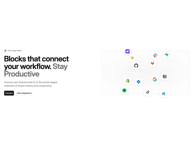
Hero202 adopts a two-column scaffold built from shadcn/ui Buttons paired with OrbitingCircles inside a bordered muted tile. Badge-led kicker, heading with tonal accent span, optional description, plus primary and outline buttons occupy the narrative column while the orbital column rotates integration logos offset from sibling hero layouts.
Muted panel separates crisp bordered icon squares from roomy typography readability.
Straightforward scanning pace that pairs exposition with animated credentials.
Breakpoints stack the orbital frame beneath copy while easing circle radii tied to shrinking container widths.