Hero 104 block design & features
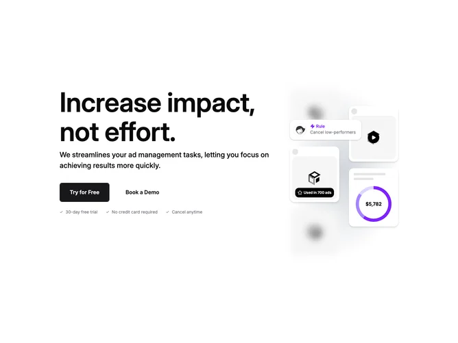
Hero104 is a two-column hero built with shadcn/ui, with text on the left and a bento-style grid of cards on the right. The left column has a large headline, supporting paragraph, two CTA buttons (primary and outlined), and a row of benefit checkmarks. The right side is a complex grid of floating cards containing blurred background images, a video play button that opens a modal, a donut chart with stats, and small UI snippets like avatars and badges.
Light background with a subtle radial gradient behind the card grid. The cards have rounded corners, drop shadows, and varying sizes arranged in an asymmetric bento layout. Some background images are intentionally blurred. The donut chart uses purple tones. Buttons have visible borders.
Polished and feature-rich with a dashboard or analytics product feel. The bento grid of mixed UI elements is distinctive and more complex than typical hero imagery. The combination of charts, avatars, and video creates a "product preview" effect rather than just decorative visuals. This is an elaborate block with high complexity. The decorative elements are CSS-driven (donut chart is SVG, cards are styled divs) rather than relying on a single hero image. To use this effectively, you'd want to replace the placeholder images and customize the stats/chart data.
On smaller screens the bento grid hides entirely, leaving just the text column centered.