Shadcn UI Hero Block
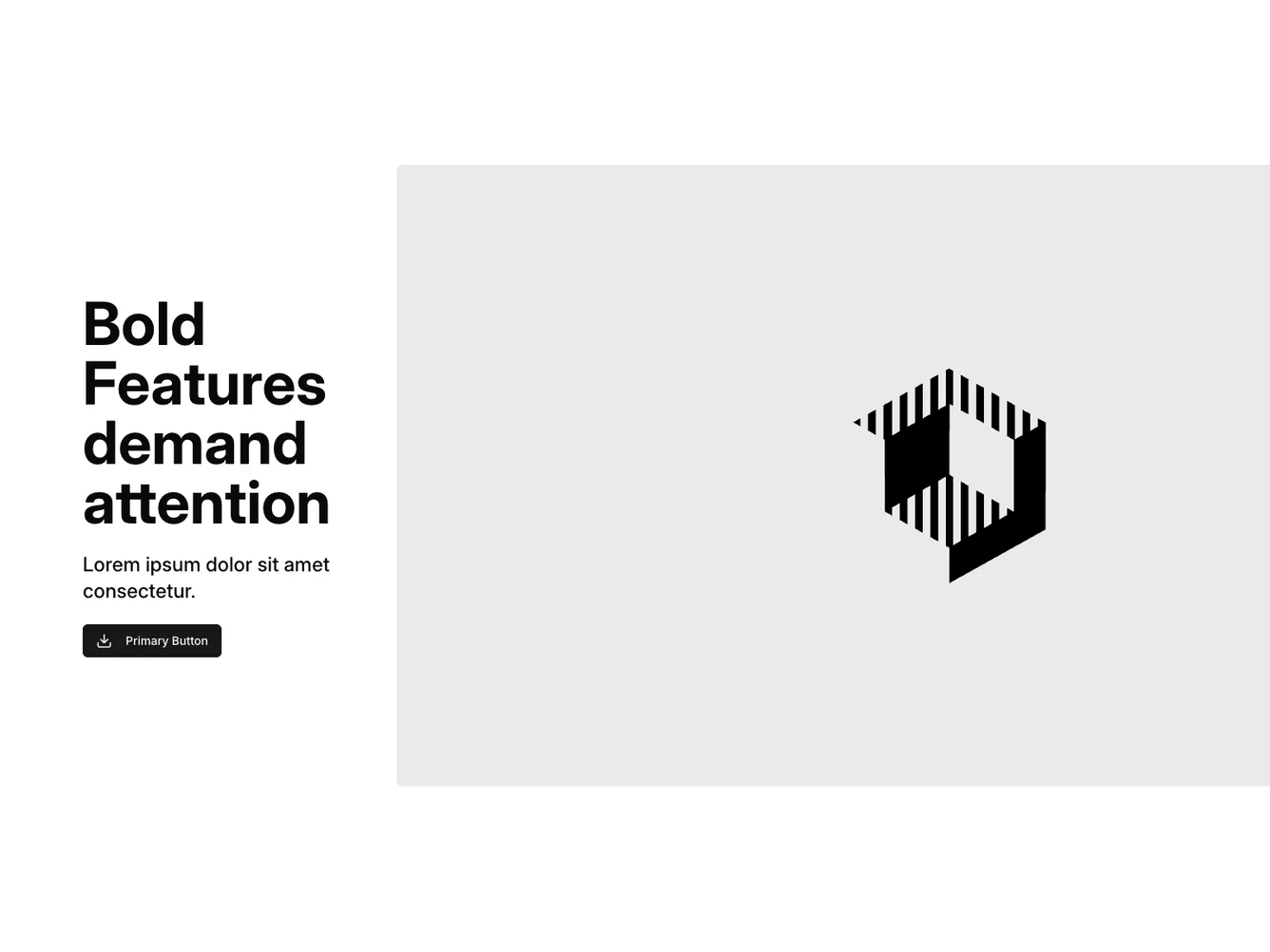
Hero5 is a versatile shadcn block designed to captivate user attention with its bold and dynamic layout. Featuring a headline that emphasizes important attributes, this component conveys impactful messages effectively. By providing a balanced mix of text and imagery, it creates a visually engaging experience tailored for diverse applications.
Designed with a focus on clarity and impact, Hero5 employs a dual-column layout where text content is harmoniously juxtaposed with a captivating visual. This shadcn component includes a prominent call-to-action button enriched with an icon, enhancing user interaction. A flexible design approach allows its adaptation across various contexts, making it a valuable asset for delivering compelling landing page experiences.
Dependencies
| Package | Type |
|---|---|
| lucide-react | NPM |
button @shadcn | Registry |
