Hero 259 block design & features
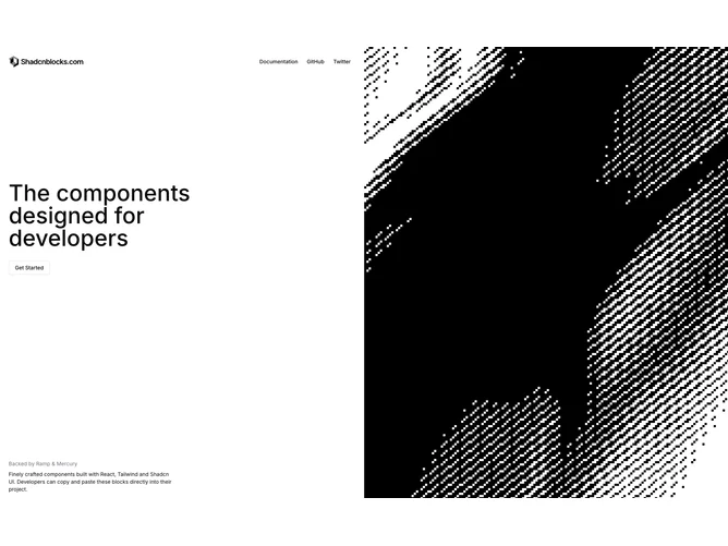
Hero259 divides the viewport vertically: the left column stacks company logo, ghost navigation buttons, a large medium-weight headline, outlined shadcn/ui CTA, and compact footer copy describing incubators and positioning. The right column is dominated by a continuously shifting monochrome grain animation that fills height edge-to-edge inside the grid gap.
Typography favors restrained sizing steps and tight leading so the text column feels editorial beside the noisy visual field. Buttons stay minimal to preserve focus on the headline narrative.
The pairing reads experimental-tech or venture narrative rather than ecommerce glam; the animated field supplies atmosphere while text carries factual scaffolding.
Expect to tune logo assets and links heavily because the layout exposes sparse chrome; weak branding disappears against the animated side.