Hero 55 block design & features
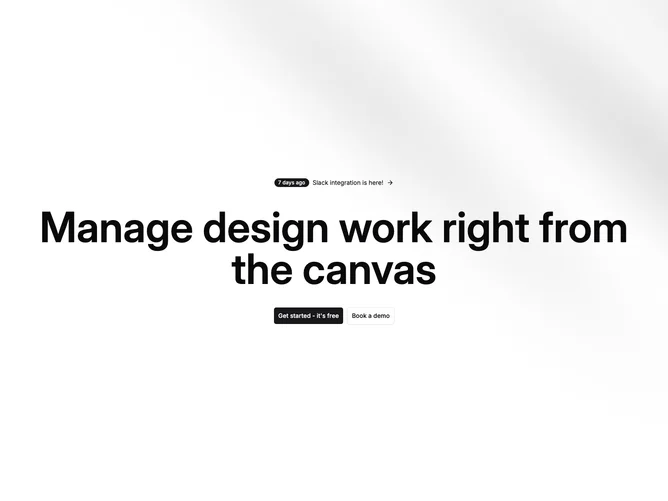
Hero55 fills the screen vertically with a faint directional texture anchoring centered marketing content built from shadcn/ui badges and buttons. The top interaction reads like a changelog teaser: pill badge, sentence fragment, and trailing chevron inside a rounded hover surface.
Headline scale jumps aggressively on wide layouts while CTA pair splits solid recruitment against outlined demo booking.
Mood lands productivity-suite calm thanks to generous vertical centering and restrained chrome beyond the announcement strip.
Mobile keeps identical vertical centering but stacks buttons full width until breakpoints reunite them inline.