Hero 274 block design & features
Hero274 is a centered marketing hero built with shadcn/ui, featuring a large headline, a wide landscape image inside the page container, and three icon-led feature columns below separated by vertical rules on desktop. Hovering each feature column crossfades the hero image to the matching slide from a shared image set; moving the pointer away returns to the first slide.
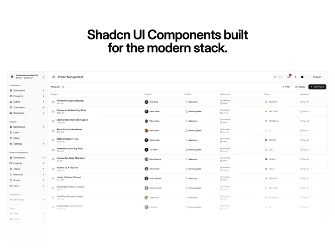
Light background with muted body copy and semibold feature titles inside circular icon plates. The image sits in a bordered frame with rounded corners and a soft bottom gradient veil, with dotted radial ornaments scrimmed behind the corners. Crossfades run about half a second with minimal motion elsewhere.
Polished and interactive with a product-preview feel driven by hover rather than autoplay. The feature-slider pattern is a fresh take on static hero imagery, requiring multiple coordinated images plus three feature lines with icons. Moderate complexity from client-side hover state coordinating columns and slides.
On touch devices the first image stays primary unless extended with tap or carousel controls. Feature columns stack on mobile while vertical rules hide on smaller breakpoints.