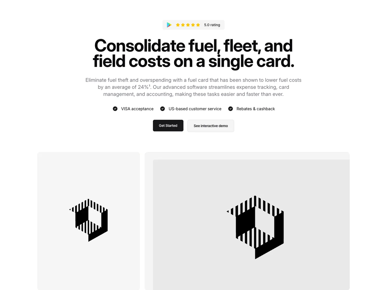
Shadcn UI Hero Block
The Hero177 component is a versatile shadcn block designed to create an impactful introduction section, particularly useful for showcasing products or services with ratings and compelling call-to-action buttons. With a focus on visual appeal and concise messaging, it effectively captures user attention right from the start, presenting critical information in a well-organized layout.
This shadcn component combines visual elements with practical content, including a badge displaying a high app rating and a powerful headline emphasizing key benefits. The inclusion of a short description reinforces the headline's message, while the list of features highlights the main advantages. Furthermore, the component offers prominent call-to-action buttons encouraging user engagement and exploration through actions like "Get Started" and "See interactive demo." The layout is enhanced by strategic use of image ratios showing product visuals or related themes, adding to its overall attractiveness.
Dependencies
| Package | Type |
|---|---|
| lucide-react | NPM |
aspect-ratio @shadcn | Registry |
badge @shadcn | Registry |
button @shadcn | Registry |
