Hero 20 block design & features
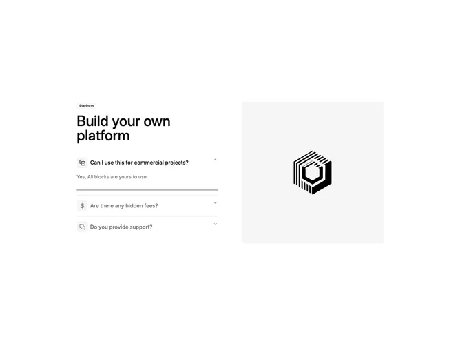
Hero20 splits the viewport into two balanced columns built from shadcn/ui accordion, badge, and carousel pieces. The left stack introduces an outline badge, medium-weight headline, then accordion rows where each trigger pairs a muted square icon tile with a multi-line question while open panels reveal short answers.
Selecting an accordion item snaps the right-hand carousel to the matching slide so photography always aligns with the active FAQ. A timed rotation advances the open accordion on its own, and each answer ends with a slim progress rail that restarts when the section holds focus, hinting how long the block lingers before moving on.
Fade-style carousel motion keeps imagery swaps soft compared to sliding galleries, which suits explanatory storytelling more than rapid product tours.
Expect to supply three coherent question-and-image pairs because timing and carousel length assume that shape out of the box.