Hero 256 block design & features
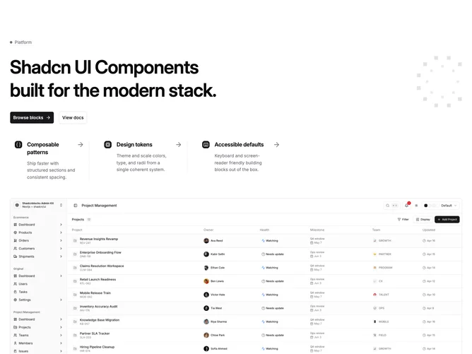
Hero256 from shadcn/ui stacks a text-heavy band, then a three-column feature strip, then a landscape image at the full width of the page container without an extra max-width cap on the frame. The upper area pairs left-aligned copy (small dashed-accent badge, large semibold headline, two buttons) with a decorative right-side panel on desktop: a masked grid field and a ring of small rotated squares suggesting motion or coverage.
Between headline and image, a width-capped three-column feature strip sits left-aligned in the container with dashed separators on small screens and split borders on medium, each item exposing a tinted icon tile, title, optional description hidden until the large breakpoint, and a trailing arrow affordance when the row is linked.
Overall feel is product-marketing with engineered ornament: geometry and grids do the styling work. Complexity is moderate to elaborate due to the decorative layer, conditional feature links, and the finishing hero asset.