Hero 230 block design & features
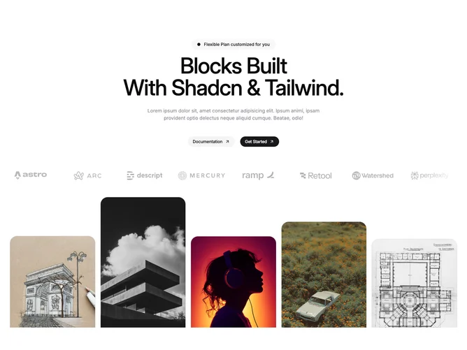
Hero230 is a marketing hero built with Shadcn UI carousels and buttons. After the headline stack, a horizontal logo marquee auto-scrolls behind left and right gradient masks. Below, another carousel advances photos inside rounded-top tiles that lift slightly on hover, creating a filmstrip rhythm.
Buttons are paired pill shapes with arrow motion. Imagery and logos are data lists you can replace wholesale.
The layout reads busy-in-a-good-way for social proof plus product shots. Complexity is moderate due to two simultaneous motion systems.
Small screens keep the vertical order: copy, logos, then images, with carousels still swipeable.