Hero 33 block design & features
Hero33 uses props to drive badge copy, headline, description, twin anchor buttons from shadcn/ui, optional pricing block, and hero photography inside a two-column grid constrained by the large breakpoint container behavior coded into the section shell.
Text aligns center on phones yet snaps left when space allows, letting the primary trailing-arrow button and outline secondary breathe on one row.
The bordered pricing card repeats label, emphasized currency amount, unit suffix, and helper sentence so finance-led launches can anchor proof beside imagery.
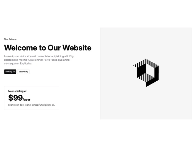
Opposite column imagery stretches edge-to-edge vertically for magazine editorial tension rather than boxed thumbnails.