Hero 100 block design & features
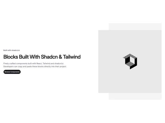
Hero100 is a two-column hero built with shadcn/ui, with text on the left and a square image on the right. The text column contains a category label, large headline, supporting paragraph, and a single rounded CTA button. The image sits in front of a muted background panel that extends off to the right.
Light background with dark text. The muted panel behind the image bleeds off the right edge of the screen. Pill-shaped button with a subtle scale-up on hover. Spacious vertical gaps between text elements. Static, no animations.
This has a minimal, understated look close to a shadcn-default or wireframe style. The offset background panel is the only decorative touch. Standard two-column pattern without much embellishment.
Stacks to single column on mobile with the image below the text. The background panel creates an edge-to-edge bleed effect on desktop.