Hero 115 block design & features
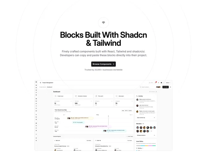
Hero115 is a single-column centered hero built with shadcn/ui. A large decorative stack of concentric circles sits behind the content, softened by a vertical mask so the rings fade at the top and bottom. In front of that, a small circular frame holds a leading icon, then a width-capped headline, balanced supporting paragraph, and one large primary button with a trailing arrow. An optional short line of muted byline copy can sit under the button, followed by a bordered hero image with a maximum height and rounded corners.
The ornament reads as nested outlines and rings in the default border color, centered in the viewport, with nested padding echoing the ring steps. Typography is semibold on the headline with tight tracking, larger body copy with muted foreground, and the icon chip is a simple outlined circle. The hero image uses a taller crop on narrow widths and a wide crop from the medium breakpoint, anchored toward the top of the frame. Nothing animates beyond ordinary interactive controls.
The look is calm and product-marketing oriented: the rings add depth without photos or gradients in the main foreground. This is a moderate-complexity block visually because of the layered decorative background, but the author surface stays simple: icon, strings for heading and description, one CTA, optional byline text, and hero imagery.
On small screens the primary button stretches full width and relaxes to content width from the small breakpoint. Content stays centered throughout.