Hero 24 block design & features
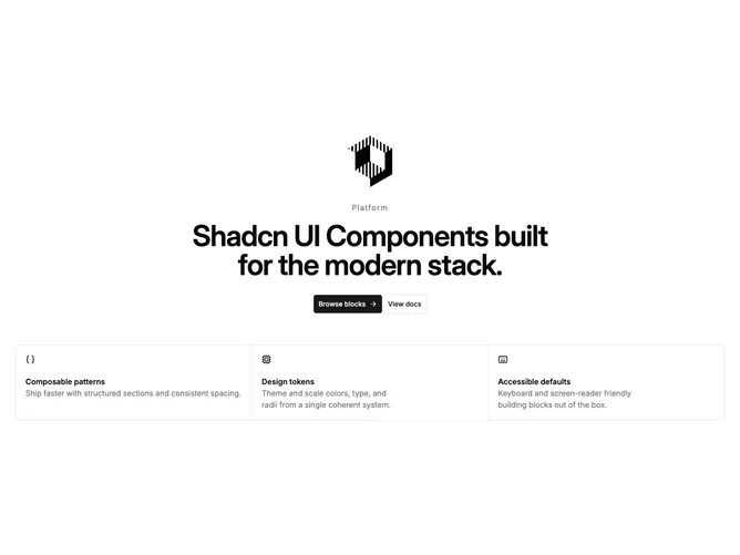
Hero24 is a single-column marketing hero built with shadcn/ui, centered on the page with stacked logo, small tracking label, large headline, and two stacked buttons. Below that sits a four-column grid on large screens where each cell is an icon, short title, and muted description inside a bordered panel with shared gutters.
Visually the block reads as a tight typographic stack over a structured feature matrix. Primary weight is on the headline; supporting text lives in the grid. Hairline borders and shared gutters between cells give a segmented, product-tour feel without heavy decoration.
The layout is a straightforward pattern: hero copy first, proof-style features second. Complexity is moderate because of the responsive grid and the need to keep four feature items balanced. On small breakpoints the grid collapses to fewer columns while keeping readable line length.