Hero 276 block design & features
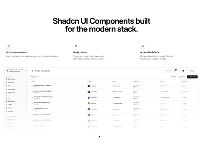
Hero276 is a centered marketing hero built with shadcn/ui, featuring a large headline, a three-column hover feature row above a crossfading image, and decorative dots under the frame that reflect the active slide. Each feature column highlights on hover and selects the corresponding slide in the opacity stack; vertical rules separate columns on desktop.
The image area reuses a bordered, top-cropped wide frame with dotted ornaments scrimmed behind the corners and a bottom gradient veil. Feature cells center on small viewports and align start on medium screens so copy stays scannable beside icons. Dots under the image mirror the active index for quick orientation and are decorative only.
Moderate complexity comes from coordinating hover on a wide row, crossfaded media, and synced dot highlights. The inverted vertical rhythm, features above image, distinguishes this from similar slider heroes. On touch devices the first slide remains default unless tap handlers are added later.