Hero 2 block design & features
This block is the mirror of the text-first split hero: on large breakpoints the photograph or screenshot occupies the first grid column and the copy block sits beside it. On small screens the image stacks above the text so the visual still leads, then the badge, h1, description, and buttons follow in one column. Everything uses shadcn/ui Badge and Button primitives with theme tokens for borders and typography.
The content column stays centered on mobile and switches to left alignment from the large breakpoint upward, with the CTA row using the same full-width stack on narrow widths and a horizontal group from sm with start alignment on lg. The primary button carries a trailing arrow icon; the secondary uses the outline variant for contrast.
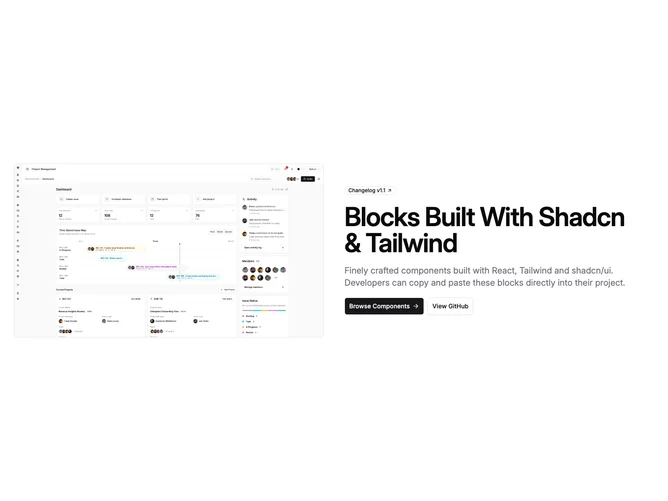
The hero image uses a fixed aspect-video frame, rounded corners, and a full border so the asset reads as a contained panel. It uses the same Image prop shape as other hero-basic blocks, with layout classes applied consistently when you pass custom assets through props.
Use this layout when you want the product shot or illustration on the left in reading order while keeping the same hero-basic props as other marketing heroes in the library.