Hero 244 block design & features
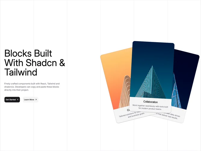
Hero244 is a playful hero built with shadcn/ui buttons and draggable card bodies. Text aligns left with commanding display type, explanatory copy, and paired solid and secondary buttons. The opposite column layers multiple rounded photo cards with rotations and offsets above instructional hint text, each card draggable for exploration.
Cards use photographic fills from a curated list. The grid border wraps the whole section with a tall minimum height on desktop.
It targets creative memberships or drops where messy piles of imagery feel on-brand. Complexity is moderate: many positioned cards plus drag affordances.
Mobile keeps the pile scaled down but still interactive where pointers exist.