

Hero 29 block design & features
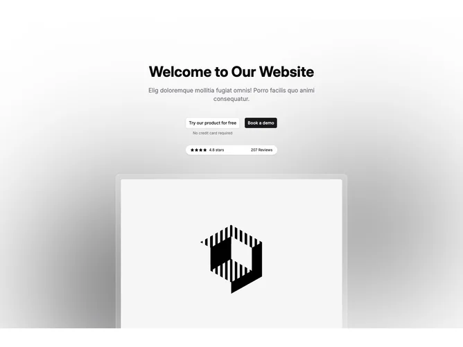
Hero29 stacks centered typography above commerce-minded controls: outline-first workflow mirrors typical signup friction messaging while the solid primary invites demos. Beneath the button pair, a pill-shaped capsule aligns stars, numeric rating, and total reviews across one muted strip.
The background plane renders soft blurred discs intersected by a faint squared lattice so the foreground remains readable without photographic clutter.
A bordered inset panel lifts hero imagery slightly negative into the following section, creating overlap continuity rather than a hard cutoff.
Props expose headings, buttons, review aggregates, and image URLs so teams can tune SaaS launches quickly without rewriting layout primitives.