

Hero 4 block design & features
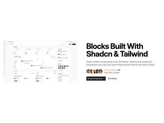
Hero4 is a two-column hero built with shadcn/ui that pairs a tall hero image with a text column on large screens. The image sits inside a muted panel, is right weighted on wide layouts, and uses rounded corners with responsive max heights. The text side carries a large title, supporting paragraph in muted foreground color, a row of overlapping circular avatars next to a five-star display with a numeric score and short review label, and two actions built as primary and outline buttons with a small trailing icon on the second control.
Padding is roomy, the palette stays neutral aside from the yellow star fill, and the muted panel creates separation without a heavy frame. Headline size steps up across breakpoints while body copy widens on large screens. Avatar borders read as light hairlines, the rating row is compact, and the stacked proof sits above the button pair so the story flows image, message, proof, then action.
The block is straightforward marketing hero work with an obvious social-proof strip, closer to a product landing pattern than a minimal editorial layout. It does not rely on animation, video, or illustration, so the personality comes from photography or illustration you supply in the image slot plus whatever tone you write into the heading and paragraph.
Below large breakpoints the layout stacks, the text block recenters, and the buttons stretch full width on small screens before switching to an inline row where space allows.