Hero 18 block design & features
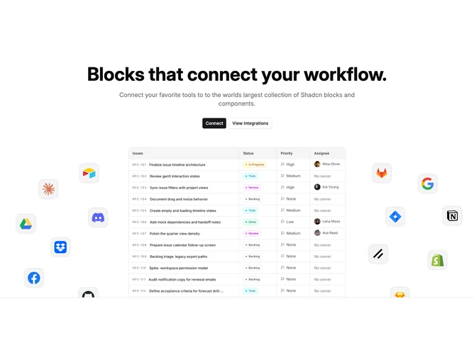
Hero18 opens with a centered column built from shadcn/ui buttons beneath a bold headline and muted supporting paragraph, keeping interactions straightforward before any imagery appears. Props drive heading strings, dual CTAs, an integration icon list, and a square hero asset so teams can swap SaaS screenshots without rebalancing layout.
From medium breakpoints upward, twelve small rounded tiles orbit the main image on both sides, each inset with glyph artwork inside accent panels while remaining non-interactive cues. Mobile hides that constellation so only the portrait stack remains, avoiding cramped tap targets.
The block communicates marketplace breadth through satellite logos rather than paragraphs, making it useful when integrations are the story.
Expect to curate icon artwork carefully because uneven saturation reads louder here than in text-only heroes.