Hero 76 block design & features
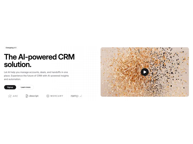
Hero76 uses a two-column layout on large screens: copy, badge, buttons, and a bordered logo strip on the left; product screenshot on the right inside a framed card with a subtle gradient halo.
A radial dot pattern and soft primary or chart glows differentiate the backdrop from grid-based hero-saas siblings. Logos render in a static strip (not a marquee) with an optional label from the hero-saas content pack.
Swap pack content or images without changing the layout primitives.