Hero 6 block design & features
Hero6 opens with a centered stack built from Shadcn UI buttons and typography: large semibold headline, muted paragraph, then primary and ghost actions both carrying chevron icons so paired journeys stay visible.
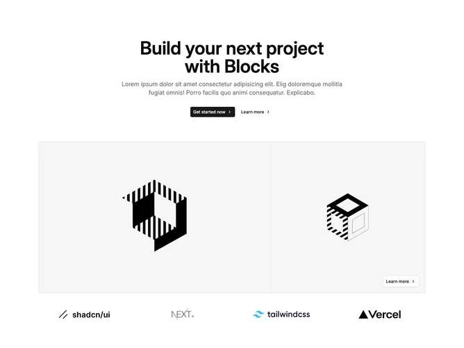
Below the text band a thin bordered grid tiles photography across five columns where one wider span carries an overlay outline button anchored to the corner for a secondary narrative cue.
A logo runway repeats familiar toolchain marks in uniform heights to imply integrations without adding prose lists.
Overall depth comes from the mosaic imagery plus logo strip rather than from extra form fields or cards.