Hero 34 block design & features
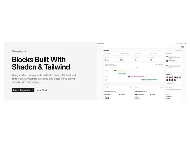
Hero34 stacks optional badge text, semibold headline, muted paragraph, and twin anchor buttons from shadcn/ui inside generous padding on a muted panel before handing off to photography that occupies the full opposing column height.
Center alignment on small screens keeps marketing tone approachable, while large breakpoints justify content start on the left so long headlines align with typical editorial grids.
Primary buttons append arrow icons for directional emphasis while secondary outlines stay quieter.
This pattern suits announcements needing equal weight on story and environmental photography without extra ornament.