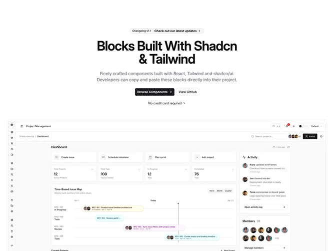
Hero 21 block design & features
Hero21 is a single-column centered hero built with shadcn/ui. At the top, a rounded full-width promo strip behaves like a compact announcement row: an outline badge carries the label, an optional announcement line sits beside it with a chevron, and the entire strip is one link. Below that sit a width-capped headline, balanced supporting paragraph, primary and outline secondary buttons with the primary carrying a trailing arrow icon, and an optional lightweight text link with a dashed underline and small chevron. The lower half is a hero image inside a thin frame: a band of padding and top corner rounding wraps a bordered photo that uses a taller crop on narrow widths and a wide crop from the medium breakpoint, with a maximum height so the scene reads as a preview rather than a full bleed.
Light foreground on a default page background. The pill uses muted fill with a contrasting outline badge chip. Typography follows a standard marketing scale with semibold headline tracking and muted body copy. The tertiary link reads as a footnote under the buttons rather than a third solid button. The section is separated from what follows by a bottom border and generous top spacing.
The pattern is familiar hero-basic stacking with two notable extras: the richer promo row and the tertiary dashed link. Complexity stays moderate. You supply badge label and optional announcement, headline, paragraph, two button labels, optional short trust or disclaimer copy for the link, plus hero imagery that fits a horizontal desktop crop.
On small screens the announcement line truncates with an ellipsis until wider breakpoints relax it, and the two main buttons stack to full width before returning to an inline row.