Hero 27 block design & features
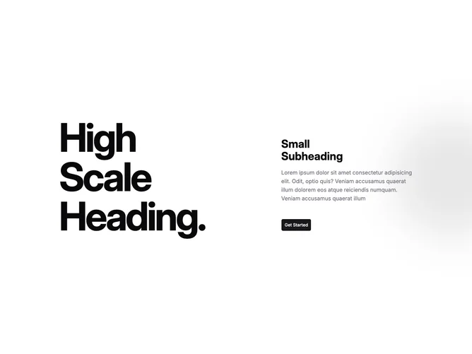
Hero27 anchors shadcn/ui minimal chrome against expressive typography: the left span holds three broken lines of oversized condensed words that each nudge horizontally when hovered, while the right column stacks a bold multi-line subheading, muted paragraph, and large button whose hover state reveals a sliding tinted sheet beneath the label.
Background atmosphere comes from a subtle diagonal wash plus a blurred primary-tinted orb parked off the right edge, keeping depth without introducing photography.
The pairing reads editorial-meets-product-launch: restrained components wrapped around loud type.
On smaller breakpoints the columns collapse so the stacked headline leads and the supporting stack follows without losing spacing rhythm.