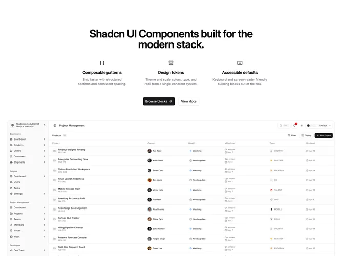
Hero 281 block design & features
Hero281 is a shadcn/ui client layout related to Hero279, but the reading order leads with copy. A centered headline opens the section, followed by a responsive row of icon-led feature cards with titles and muted supporting lines, then a primary plus outline button pair.
Below that sits an autoplay carousel across the content width with rounded bordered slides, slide index text, and dot controls.
Moderate complexity comes from the carousel state, autoplay plugin, and keeping three slides and three feature items aligned when you customize content.
On narrow widths the feature grid stacks before the carousel; spacing between the copy block and carousel stays explicit so the section does not feel cramped.