Hero 71 block design & features
Hero71 layers peach-to-cream radial washes behind bold relationship-focused headline copy paired with shadcn/ui outline and solid buttons arranged responsively as stacked then side-by-side CTAs.
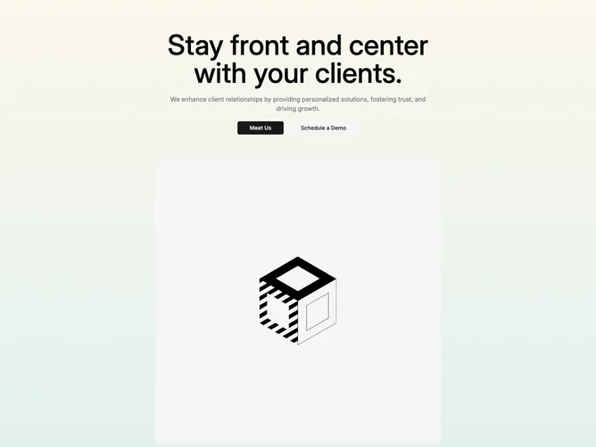
Supporting paragraph clarifies bespoke engagement promises while imagery beneath adopts configurable max width prop controlling photography prominence without rewriting layout primitives.
Rounded portrait-friendly photography slots reinforce hospitality or consulting narratives especially when subjects face camera.
Overall composition favors warmth over stark minimalism thanks to gradient fills wrapping entire section.