Hero 167 block design & features
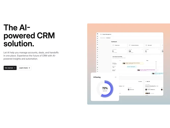
Hero167 is a two-column hero built with shadcn/ui buttons where copy sits on the left and a tall gradient-wrapped media panel sits on the right. The text column carries a display heading, muted paragraph, and paired primary and outline buttons with trailing arrow icons. The visual column uses a chart-tone gradient wash as an outer frame around a bordered main image with top-weighted cropping.
A square inset thumbnail hangs outside the bottom-left corner of the main photo on a white card with a subtle shadow. The media panel extends slightly past the container on the right edge so the gradient field feels wider than the text column on desktop.
Visually the block layers gradient framing, nested rounding, and an outside inset for a polished SaaS marketing tone. Complexity is moderate and mixed: the gradient frame is CSS-driven while two coordinated product images carry the story.
On narrow screens the layout stacks with the gradient panel simplifying to full width while padding preserves the outside inset offset.