Shadcn UI Hero Block
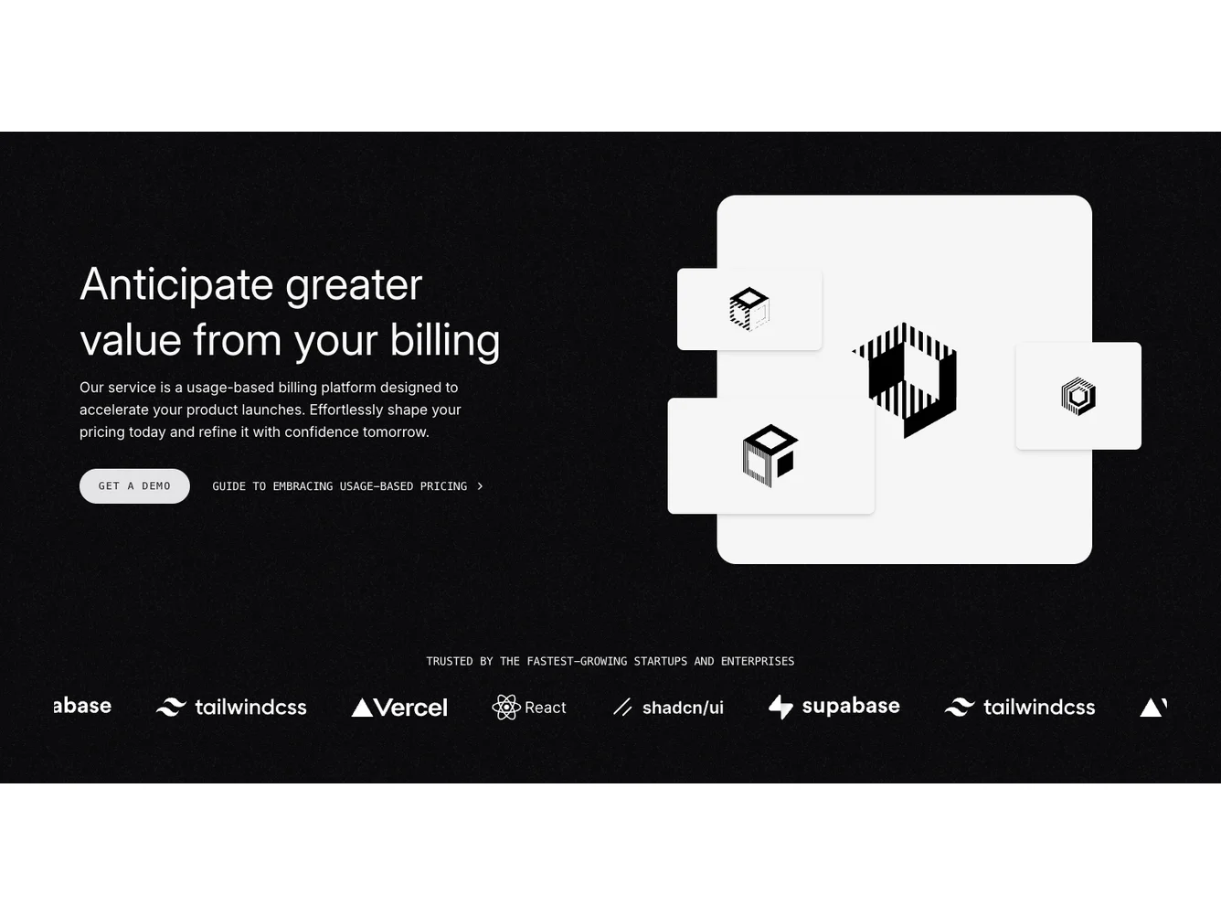
Hero103 is a two-column hero with text on the left and a layered image collage on the right. The text column has a large headline, supporting paragraph, and two CTAs (a primary pill button and a text link with chevron). The right side features a main image with three smaller floating cards overlapping it at different positions. Below both columns is a full-width auto-scrolling logo carousel with a “trusted by” label.
Dark background with a subtle noise texture overlay. The floating image cards have rounded corners and drop shadows creating depth. Monospace uppercase text on the buttons and carousel label. The logo carousel scrolls continuously without user interaction.
Dark, polished, and slightly techy. The noise texture and floating card arrangement give it more visual interest than a standard two-column layout. The monospace uppercase typography adds an editorial or developer-focused feel. Distinctive but not experimental.
Dependencies
| Package | Type |
|---|---|
| embla-carousel-auto-scroll | NPM |
| embla-carousel-autoplay | NPM |
| lucide-react | NPM |
button @shadcn | Registry |
carousel @shadcn | Registry |
