Hero 16 block design & features
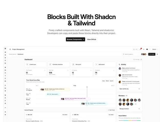
This block is a centered, single-column marketing hero built with shadcn/ui buttons. The copy stack sits above the media: a heading, a supporting paragraph in muted body color, and a row of primary and outline secondary actions. Layout uses a max-width column so the heading and description stay readable while the section still reads as full width within the page container.
The image lives in its own band below the text, inside the same horizontal rhythm as the heading block. A linear gradient mask fades the photo out toward the bottom edge so the hero feels lighter where it hands off to the next section. The image uses rounded corners, a theme border, and object-cover inside a fixed widescreen frame so the slot stays stable while the asset loads.
Primary and secondary actions use the standard large button variants with anchor children for framework-neutral linking. On small screens the CTAs stack full width; from the small breakpoint up they sit inline and center as a group. The primary control can carry a trailing arrow icon for hierarchy while the secondary stays text-only.
Use this pattern when you want a simple narrative hero with a product shot or illustration that should disappear softly instead of ending in a hard crop. It suits SaaS landing intros, campaign pages, and any layout where the next section should meet a softened image edge rather than a sharp rectangle.