Hero 261 block design & features
Hero261 is a two-column hero built with shadcn/ui Button components and a fixed set of feature rows with Lucide icons. The main column leads with an h1, optional large supporting paragraph in muted color, then a primary and outline secondary CTA. The companion column shows up to four items with a bold title and short description; a dashed rule divides the columns on large screens and sits above the list on small breakpoints when the layout stacks.
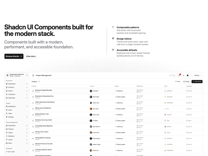
The dashed accent uses repeating linear gradients and a mask so the line softens at the ends. Below the text area, a wide 16:9 frame (aspect-video) holds one hero image, with a subtle radial grid scrim, theme border, and rounded corners.
Spacing and type stay restrained: tight tracking on the title, generous section padding including extra top padding on large screens, and no gradient fills on the main surfaces beyond the outline button default. The block suits SaaS or developer product landings where you want bullets-as-features beside narrative copy and a strong product shot underneath.