Shadcn UI Hero Block
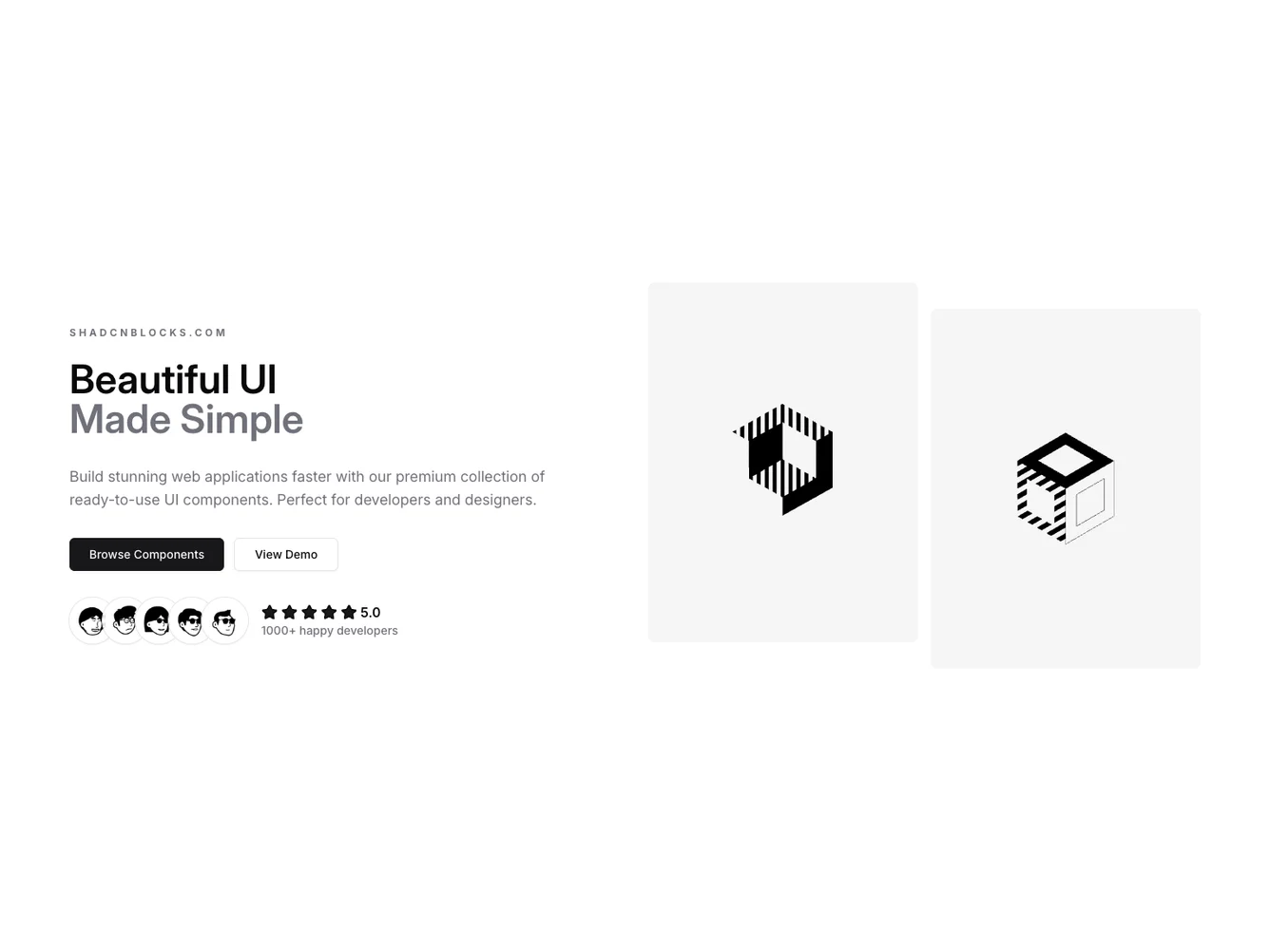
The Hero80 component serves as a visually engaging introduction section for applications, focusing on displaying UI elements in an attractive manner. It combines vibrant design elements with practical functionalities, encouraging visitors to explore further. By integrating appealing visuals and strategic calls to action, this shadcn ui component enhances the user's initial experience and sets the tone for the rest of the application.
Delving deeper into its design, the Hero80 component features a meticulously crafted layout with two primary columns. The left column includes dynamic text elements, action-driven buttons, and an avatar group with ratings, establishing trust and credibility. Meanwhile, the right column displays high-resolution images, showcasing the application's visual capabilities. With its sophisticated background gradients and patterns, this shadcn component ensures a compelling and dynamic presentation, perfect for drawing in users and highlighting key offerings.
Dependencies
| Package | Type |
|---|---|
| lucide-react | NPM |
avatar @shadcn | Registry |
button @shadcn | Registry |
