Hero 275 block design & features
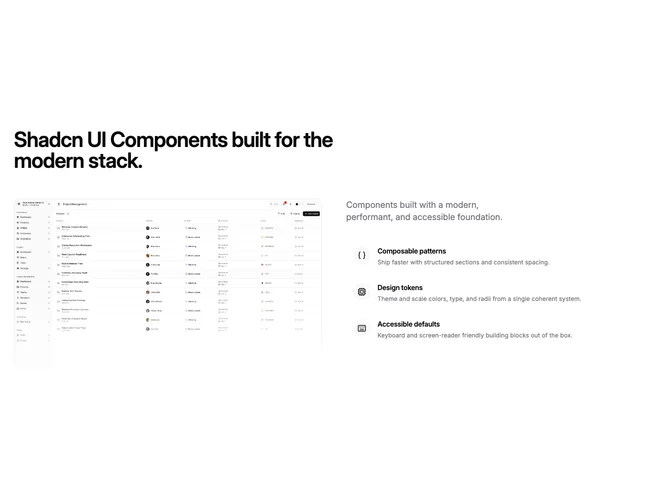
Hero275 is a split marketing hero built with shadcn/ui, opening with a left-aligned headline and dividing into two columns on wide screens: a fixed-aspect image stack on one side and an optional muted lead paragraph above a vertical icon feature list on the other. Hovering each feature fades the image stack to the matching slide; moving the pointer out of the feature column restores the first slide.
On small screens the order reads headline, image, then description and features so the visual still lands before the interactive list. The image column uses top-weighted cropping, rounded corners, a theme border, and a light bottom veil. Feature rows use rounded hover surfaces and circular icon mounts on a muted plate.
Moderate complexity from one client index driving both columns; authors should keep feature and image counts aligned for predictable previews. The split layout suits product pages that want copy and proof beside a crossfading preview rather than a centered stack.
Touch users stay on the first image until extended with tap targets or focus behavior.