Hero 280 block design & features
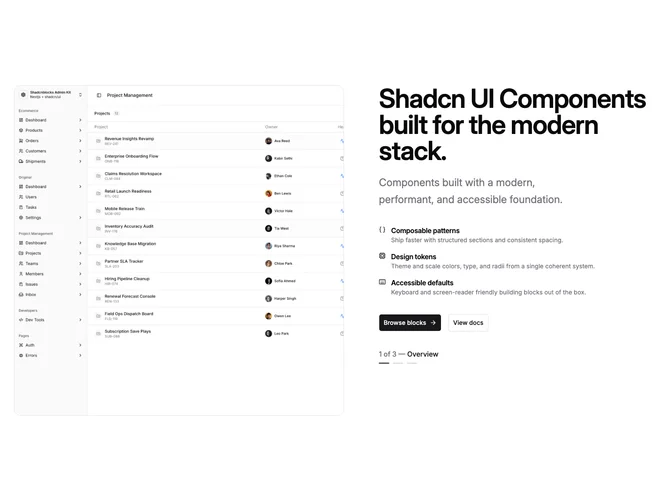
Hero280 is a shadcn/ui block that swaps column order on large screens: carousel media on the left, narrative on the right on desktop, while mobile stacks copy ahead of the carousel. The text column pairs a semibold headline, muted description, vertical list of icon features, and two buttons with slide dots hidden or shown by breakpoint.
Carousel slides use rounded corners so UI mockups or photography with varying ratios stay legible. Autoplay keeps the gallery moving until a user interacts.
This variant is moderately complex due to ordering utilities, separate indicator placements for mobile versus desktop, and balancing copy length against a tall carousel column.