
Hero 68 block design & features
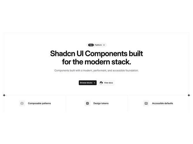
Hero68 is a shadcn/ui block framed by dashed borders: an upper panel holds a rounded announcement row with a small badge, eyebrow text, and an inline arrow affordance, followed by a centered headline, optional supporting paragraph, and two full-width-on-mobile buttons. One secondary treatment can pair an avatar with label-style text. A lower grid divides into three cells with icons and short titles.
The look is diagrammatic and editorial: hairline dashes and spark markers at the corners signal a structured layout rather than a soft gradient hero. Hover-opacity on linked feature rows adds a little interaction without motion libraries.
Complexity is moderate due to the bordered regions, mixed CTA content, and three-up footer strip. You need concise feature titles because descriptions are not shown in that strip.