Hero 12 block design & features
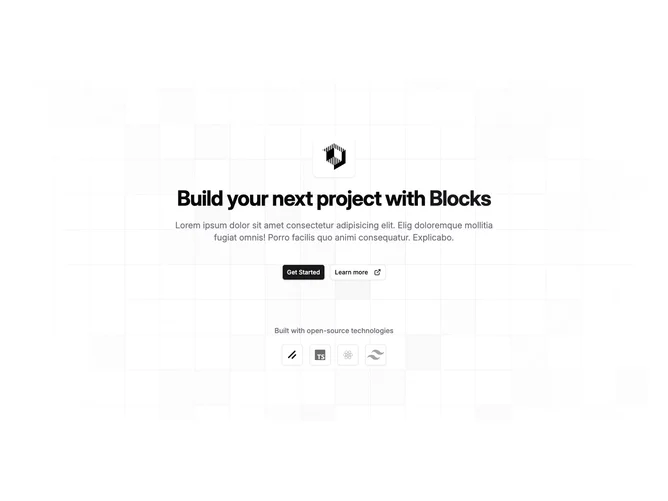
Hero12 centers marketing copy on a radially masked square-grid illustration so the middle stays bright while outer pixels fall away. Above the headline, a compact frosted panel lifts a brand illustration with blur and slight shadow. The title mixes neutral words with one accent-colored keyword, followed by wide muted body copy and two shadcn/ui buttons where the secondary adds an external-link glyph shift on hover.
Below, a label introduces a wrap row of square outline buttons that each nest a technology icon desaturated until hover restores color, implying stack familiarity without dense paragraphs.
Visually it skews open-source product launches or boilerplate marketing sites that want playful geometry rather than photography heroics.
The layout stays intrinsically centered end-to-end, so narrow phones simply tighten gaps while preserving stacking order.