Hero 3 block design & features
Hero3 splits the section into a text column and a photography column on large breakpoints, built around shadcn/ui buttons and overlapping Avatar stacks that sit next to a five-star row and numeric review summary. Copy stacks headline, muted paragraph, social proof, then primary and outline actions so scanning flows top to bottom before the eye crosses to the image.
On narrow viewports the grid collapses to a single column while typography stays centered until the layout switches to left alignment where props default.
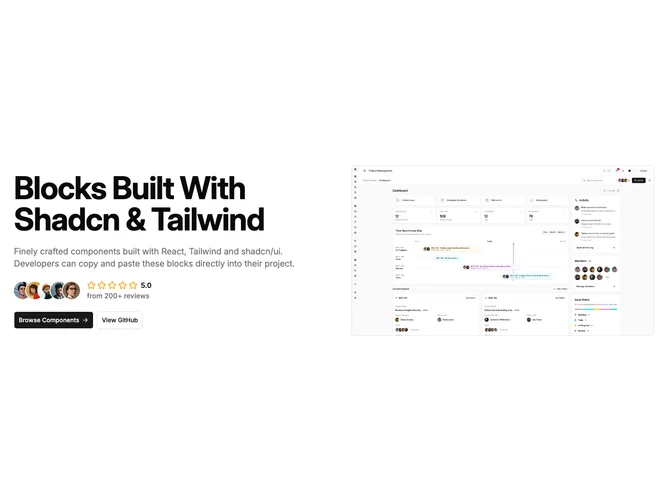
The right rail carries one tall rounded rectangle frame suited to product or editorial hero shots with generous max height.
Complexity sits in the mid range because props expose headings, buttons, avatar sources, rating, and counts without extra decorative chrome.