Hero 13 block design & features
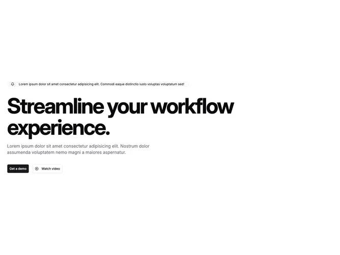
Hero13 opens with a stretched outline badge built from shadcn/ui: a circular accent chip hosts a bell icon beside truncated announcement text, signaling updates without stealing focus from the headline. Below sits a single aggressive headline line using tight tracking and responsive sizing that scales dramatically on medium breakpoints, followed by a restrained muted paragraph capped around readable width.
Primary and outline buttons align in a column on phones and row on wider layouts. The secondary control pairs a play-circle glyph with watch-copy so the hero offers both demo scheduling and media preview hints.
Visually the block leans typographic hero rather than illustration heavy; whitespace and scale carry personality while chrome stays minimal.
Expect to replace placeholder Latin strings in the badge, heading, and paragraph because the layout exposes copy directly without imagery buffers.