Hero 290 block design & features
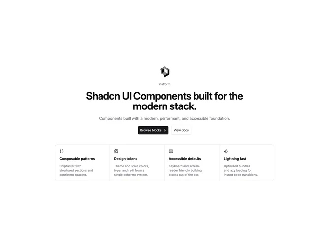
Hero290 is a centered marketing hero built with shadcn/ui featuring optional logo and badge above the headline, dual CTAs, a four-cell icon feature matrix with hairline separators, and a full-width product preview anchoring the bottom.
Neutral cards, square grid gaps, and balanced text blocks keep the section calm. Buttons use familiar shadcn sizing for generous hit targets while the feature matrix reads like a compact capability table above the screenshot.
Balanced and brand-forward with moderate content requirements: four proof lines with icons, optional logo asset, headline copy, and a polished product image. A straightforward hero-feature-icons layout without motion or sticky behavior.