Hero 160 block design & features
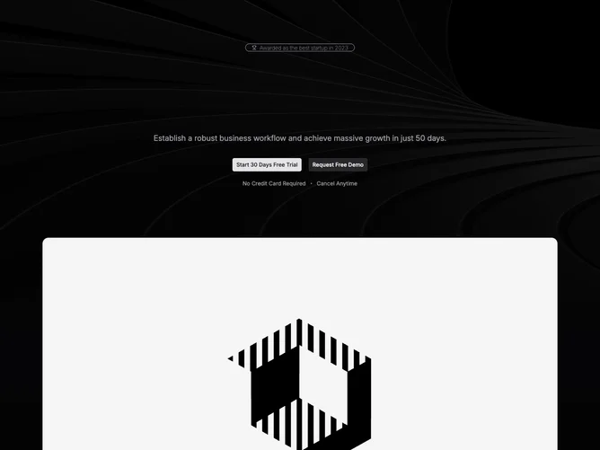
Hero160 is a stacked dark hero built with shadcn/ui with a trophy-labeled award chip, gradient-filled long headline about profit and sales, muted supporting promise, paired primary and secondary buttons, and a row of small caveats separated by dots.
A background photograph spans the top behind a gradient scrim while a large rounded bordered frame presents a wide product mockup below.
High-growth SaaS campaign style mixing photography and UI still. Elaborate due to layered backgrounds and dual visual bands.
The lower mockup stays full width within container padding as screens shrink.