Hero 31 block design & features
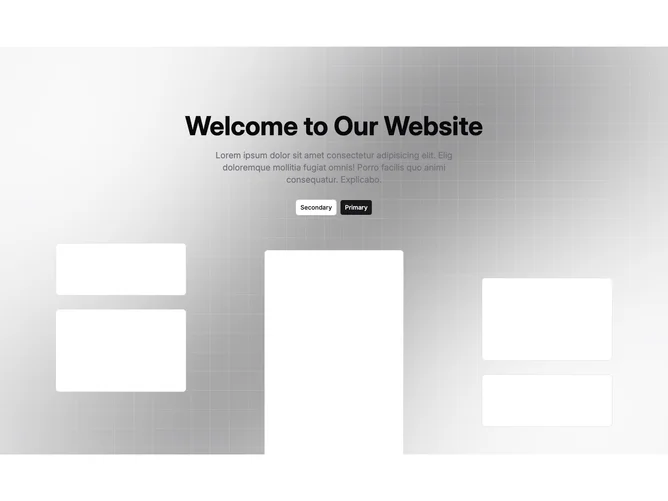
Hero31 centers marketing copy and twin anchor buttons from shadcn/ui while the lower half becomes a stage for layered rectangles that simulate dashboard tiles drifting beside a tall portrait slot.
The backdrop mixes blurred color masses with a faint tiled lattice so the hero reads luminous yet structured.
Responsive rules swap between denser pairs of floating tiles on medium widths and fuller quad arrangements only on very wide screens, keeping phones focused on copy.
Expect dramatic vertical bleed because panels extend below the fold to overlap later sections.