
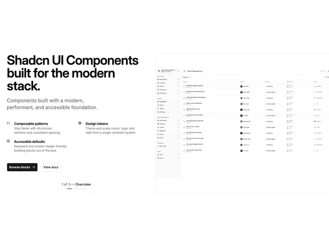
Hero 187 block design & features
Hero187 is a client-side shadcn/ui block that pairs a left column of headline, supporting copy, and a two-by-two icon feature grid with a right-hand carousel. Autoplay advances slides while a custom strip shows slide index and optional per-slide labels. A hairline gradient rule runs along the bottom of the section.
The layout emphasizes product proof: crisp type, repeated icons with short blurbs, and rotating imagery that can stand in for product shots. Carousel frames are tall enough that mixed-aspect assets still read clearly.
Complexity is moderate to high: you maintain carousel state, autoplay plugin wiring, responsive hide rules on the secondary button, and several slides worth of assets for a convincing demo.