Hero 40 block design & features
Hero40 loads the left column with prop-driven headline and paragraph copy, outline demo button with play glyph, solid primary with trailing arrow, and a vertical checklist where green checks reinforce integration breadth and trial promises. Typography skews extra-large on the title so the block announces category loudly before finer proof arrives.
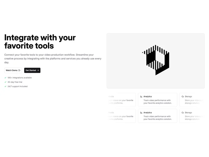
The right column stacks a widescreen media preview with rounded corners above two horizontally drifting marquee bands carrying bordered mini cards keyed by Lucide icons and short blurbs.
Edge fades mute the ends of each marquee row so motion stays readable against the page background.
This pattern suits stacks where integrations are the story and you need continuous motion without sacrificing textual positioning.