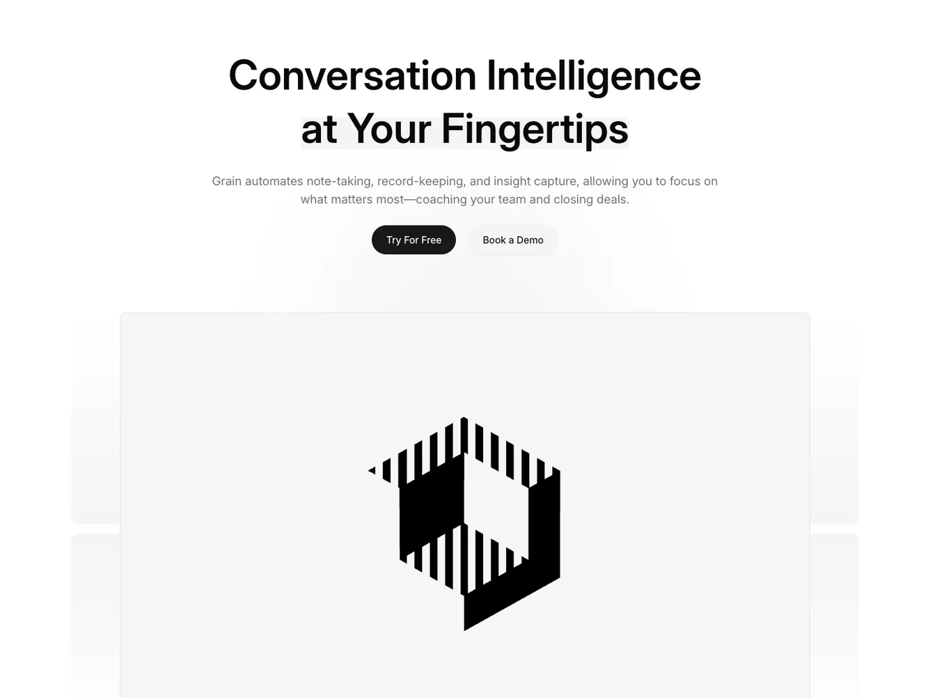
Shadcn UI Hero Block
The Hero180 component serves as a headline feature block that captures attention with its dynamic layout and engaging call-to-action elements. Designed to present key information concisely, this shadcn block combines impactful typography with strategic visual elements to reinforce its messaging. By leveraging space and style, the component effectively maintains focus on its main offerings and action invites.
In detail, the Hero180 component features a versatile layout that unifies text, imagery, and calls to action within a single compelling section. Its clever use of the aspects-ratio divisions allows for imaginative visual compositions, utilizing layered backgrounds and contrasting text elements to create a vivid presentation. The shadcn UI block includes highlighted keywords and interactive buttons, drawing users to respond to prompts such as starting a free trial or scheduling a demo. By providing visual hierarchy and clarity, Hero180 stands out as a leading choice for presenting essential offers or messages within an app interface.
Dependencies
| Package | Type |
|---|---|
aspect-ratio @shadcn | Registry |
button @shadcn | Registry |
