Hero 291 block design & features
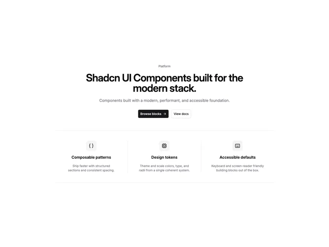
Hero291 reads like a comparison strip without literal checkmarks: each column carries an icon halo, semibold title, and muted paragraph before the panoramic screenshot repeats once for everyone. Headline work stays centered to reinforce parity between pillars.
Vertical borders appear only from medium breakpoints upward so phones rely on stacked spacing instead of cramped dividers. Buttons inherit standard shadcn/ui hierarchy beneath the introductory paragraph.
This layout suits narratives built around exactly three commitments. Adding more rows requires adjusting the component since it intentionally slices three features.