
Hero 26 block design & features
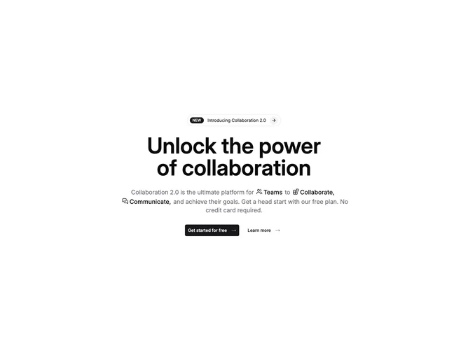
Hero26 keeps everything centered inside the container, opening with a pill-shaped link that nests a filled NEW badge, label text, and trailing circular arrow chip before the headline arrives. The hero copy beneath mixes normal sentences with inline icon-word pairs emphasized in primary color so Teams, Collaborate, and Communicate read as mini anchors inside one flowing paragraph.
Below the text, two large shadcn/ui buttons sit side by side on wider screens: a solid primary with trailing arrow icon and a quieter ghost secondary using the same arrow treatment at lighter weight.
Visually the block is airy marketing glam without photography: typography scale and rounded chrome carry the personality.
Mobile stacks the buttons while preserving centered alignment so the announcement pill still reads as the first focal point.