Hero 11 block design & features
This block is a centered marketing hero built with Shadcn UI buttons and a simple logo slot above the main title. Everything reads in one column: optional logo, heading, muted supporting paragraph, then a call-to-action row. The layout stays within a shared max-width column so the type and image line up with other hero-basic sections on long pages.
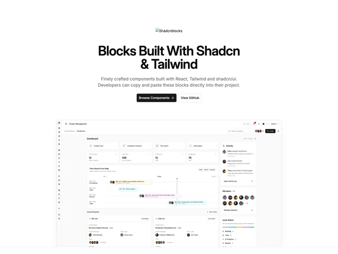
The hero image sits below the copy stack with top rounding, side and top borders only without a bottom stroke on the photo, and combined outer plus inset shadow treatment so the lower edge fades into the section band. An outer bottom border and overflow clipping keep the shadow meeting the section divider cleanly.
Primary and secondary actions use large buttons with default and outline variants. On narrow viewports the CTAs stack at full width; from the small breakpoint up they align in a centered row. The primary action includes a trailing arrow icon for hierarchy; the secondary stays text-only. The logo relies on a plain image tag with source and alt props only.
The pattern fits product marketing intros where the brand mark should appear before the headline, especially home or campaign pages where one strong visual sits under a short value proposition and paired CTAs.