Shadcn UI Hero Block
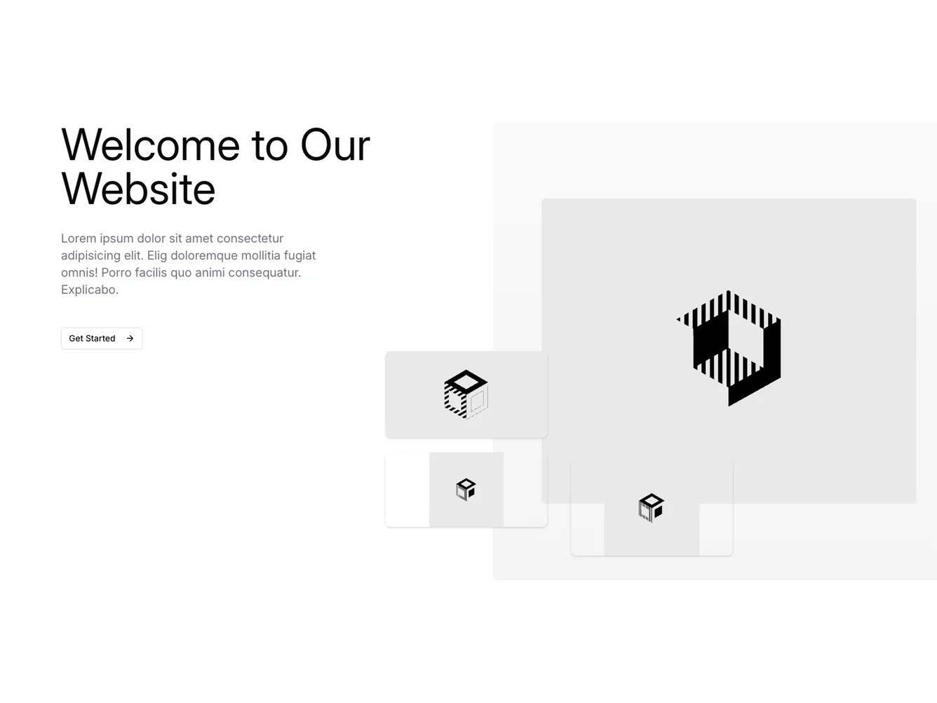
The Hero168 component is designed to serve as an introductory section for a webpage, setting the tone and providing key information to visitors right at the start. It features a prominent welcome message alongside a brief description, accentuated by visually engaging placeholder images. This combination of text and visuals aims to capture attention quickly and guide users towards taking desired actions, such as clicking the "Get Started" button.
In more detail, the Hero168 component employs a structured layout that prioritizes content clarity and aesthetic appeal. On one side, it displays a large, welcoming headline followed by a concise paragraph that could be used to deliver a marketing message, a company tagline, or an important announcement. On the other side, it presents an array of strategically placed images that add depth and context to the section. The images are intended to support the textual content, working together to create a cohesive and attractive visual block. Styled with a shadcn block design, this component effortlessly unifies text and graphics into a single interactive display that encourages visitor engagement.
Dependencies
| Package | Type |
|---|---|
| lucide-react | NPM |
button @shadcn | Registry |
