Shadcn UI Hero Block
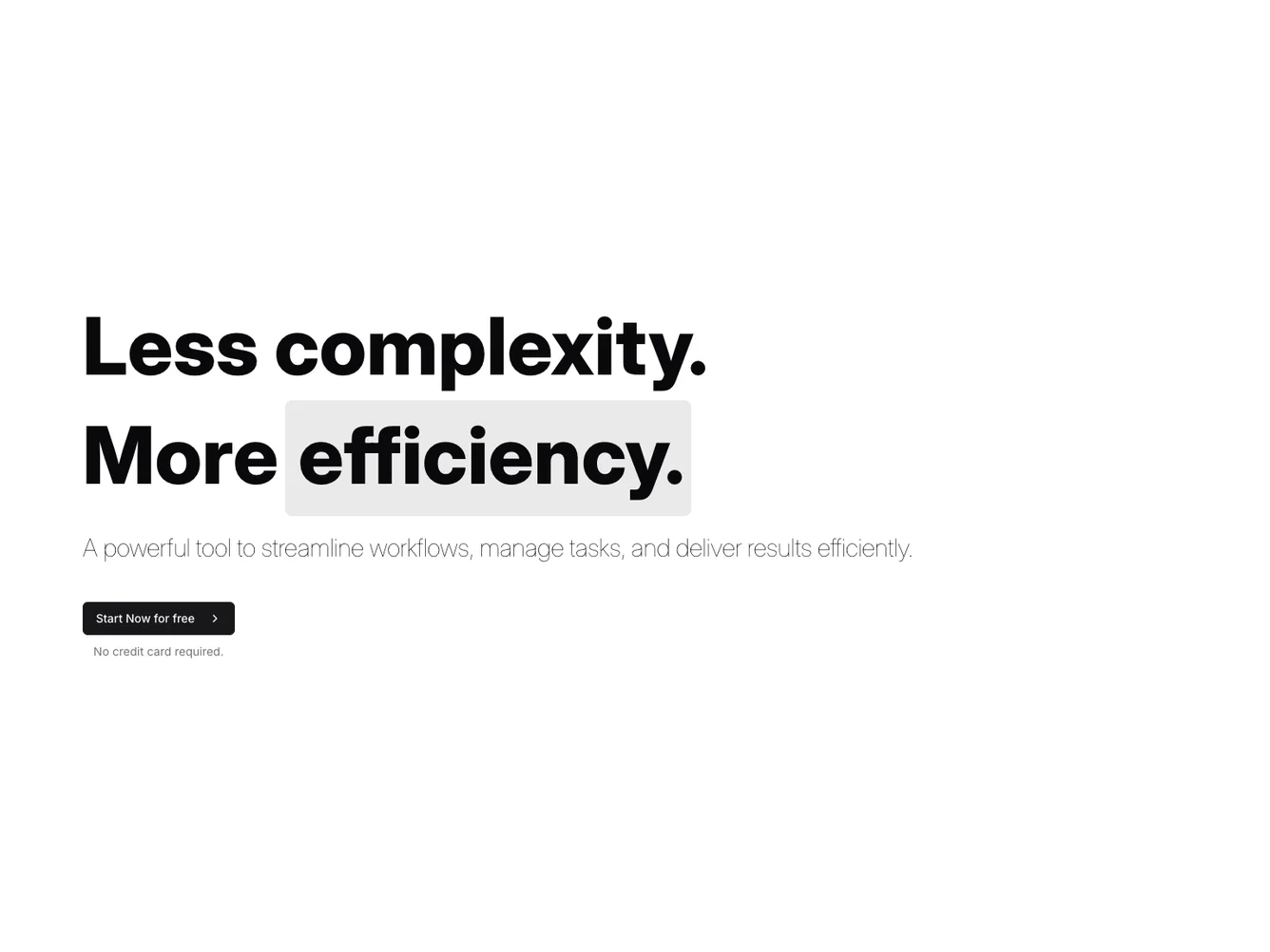
The Hero60 component is a visually impactful section designed to capture the user's attention with a bold headline and a clear call to action. It utilizes a striking combination of typography and background design to convey a message of simplicity and efficiency. As a shadcn ui block, it artfully integrates well-crafted interface elements to ensure both aesthetic quality and functional clarity.
In greater detail, the Hero60 component features an impressive headline with strong, varied typography to emphasize its core message. The overlay background effect creates a sense of depth and separation from the content, enhancing readability and visual hierarchy. The call to action is strategically placed and easily accessible, delivered within a structured layout that guides the user's focus from headline to action seamlessly. This shadcn component excels in transforming complex ideas into simple, compelling presentations, demonstrating the power of minimalist design to drive engagement and conversion.
Dependencies
| Package | Type |
|---|---|
| lucide-react | NPM |
button @shadcn | Registry |
