Hero 123 block design & features
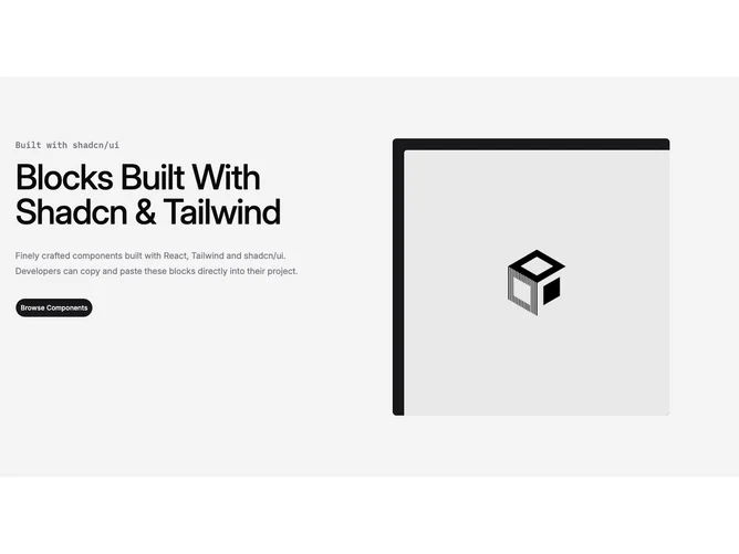
Hero123 is a two-column hero built with shadcn/ui, with text on the left and a tall photograph on the right inside a primary field with inner padding and rounded corners. The copy stack uses a monospace category line, an extra-large weight headline, supporting paragraph, and one pill-shaped primary button.
The right column is dominated by an aspect-ratio image with a small rounded window over a solid primary panel, so the photo reads as a device or card mockup. Typography stays crisp on a muted section background with generous vertical padding.
This is a straightforward marketing split layout with a single image and one action. It is moderate in complexity and easy to repurpose by swapping the placeholder art and strings.
On large screens the grid spaces the columns widely; on smaller widths the stack keeps reading order as text first, then the image.